13.2 شکل ۱ توزیع جهانی
- نصب و فراخوانی پکیجهای
tidyverseوplotly
Code
- وارد کردن دادهها
Rows: 177 Columns: 6
── Column specification ─────────────────────────────────────────────────────────────────────────
Delimiter: ","
chr  (4): Gender, Degree, Discipline, Country
dbl  (1): Age
date (1): Date

ℹ Use `spec()` to retrieve the full column specification for this data.
ℹ Specify the column types or set `show_col_types = FALSE` to quiet this message.- نگاه کلی به دادهها
df |> glimpse()Rows: 177
Columns: 6
$ Gender <chr> "Male", "Male", "Male", "Male", "Male", "Male", "Male", "Other/not disclosed…
$ Age <dbl> 69, 37, 50, 61, 54, 44, 40, 64, NA, 62, 59, 62, 44, 32, 56, 32, NA, 53, 32, …
$ Date <date> 2020-03-04, 2020-04-05, 2020-04-05, 2020-04-05, 2020-04-05, 2020-04-06, 202…
$ Degree <chr> "MD;PhD", "MD", "MD", "PhD", "MD;PhD", "MD;PhD", "MD", "PhD", "MD", "PhD", "…
$ Discipline <chr> "Addiction medicine", "Psychiatry", "General Medicine", "Psychiatry", "Psych…
$ Country <chr> "Netherlands", "Iran", "Iran", "Belgium", "Italy", "Cyprus", "Thailand", "Un…- از هر کشور چه تعداد شرکت کردهاند.
اسامی کشورها بر حسب تعداد از بیشتر به کمتر مرتب شده درون متغیر
df_countryذخیره شوند.
Code
# A tibble: 77 × 3
   value          count percent
   <chr>          <int>   <dbl>
 1 India             13    7.34
 2 United States     13    7.34
 3 Iran              12    6.78
 4 Netherlands       10    5.65
 5 United Kingdom     9    5.08
 6 Australia          6    3.39
 7 Italy              6    3.39
 8 Canada             4    2.26
 9 Indonesia          4    2.26
10 Lithuania          4    2.26
# ℹ 67 more rows
# ℹ Use `print(n = ...)` to see more rows- نمودار ستونی رسم کنید که سهم هر کشور برای شرکت در نظر سنجی را برحسب تعداد نشان دهد. به صورتی که رنگ نوارهای کشورهای با بیش یا مساوی ۹ نفر متفاوت از کشورهای
دیگر باشد و در نهایت نمودار را با فرمت
pngو با نامcountry-barchartدر پوشهimgذخیره کنید.
Code
country_barchart =
  ## importing data to ggplot
  df_country |>
  ## ggplot panel
  ggplot() +
  ## aesthetic
  aes(x = count, y = value, fill = count >= 9) +
  ## chart type
  geom_col() +
  ## custom labels
  labs(
    x = "N",
    y = "Country",
    fill = "N"
  ) +
  ## general theme
  theme_minimal(base_family = "Roboto", base_size = 6) +
  ## custom theme
  theme(
    legend.position = "none",
    plot.background = element_rect(fill = "white", colour = "white"),
    panel.background = element_rect(fill = "white", colour = "white")
  )

## save plot
ggsave(
  filename = "./img/country-barchart.png",
  plot = country_barchart,
  dpi = 300,
  width = 85,
  height = 150,
  units = "mm"
)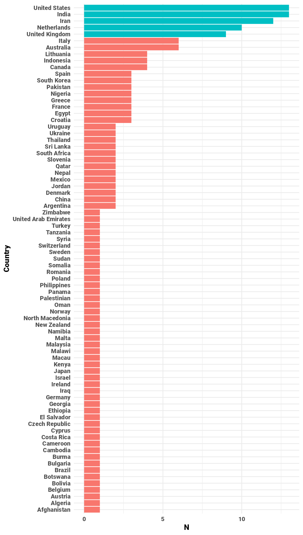
شکل 13.6: نمودار نواری تعداد افراد شرکت کننده در هر کشور
- نقشه جهان را به گونهای رسم کنید که برای هر کشور یک طیف رنگی متناسب با
تعداد افراد مشخص شده باشد.
خروجی نهایی را با فرمت
pngو با نامfigure-1-global-distributionدر پوشهimgذخیره کنید.
Code
## get global map data and save in df_world ----
df_world = map_data("world")

## check region name ----
# df_world$region |> unique()

## campare country name with region ----
# df_country[!(df_country$value %in% df_world$region), ]$value |> unique()

## correct country name ----
df_country = df_country |>
  mutate(
    value = value |> str_replace_all(c(
    "United States" = "USA",
    "Burma" = "Myanmar",
    "United Kingdom" = "UK",
    "Palestinian" = "Palestine"
    ))
  )

## merge two data base ----
df_world = full_join(
  ## remove Antarctica area
  df_world |> filter(region != "Antarctica"),
  ## remove Macau
  df_country |> filter(value != "Macau"),
  ## merging global world by region with country by value ----
  by = c("region"="value")
)

## check data frame after merging ----
# df_world |> filter(is.na(region))

## importing map in global_map variable ----
global_map =
  ## inserting data in ggplot
  df_world |>
  ## creating ggplot panel
  ggplot() +
  ## setting x, y, group and label in aesthetic
  aes(x = long, y = lat, group = group, label = region) +
  ## drawing colored map base on count
  geom_polygon(aes(fill = count), color = "black", lwd = 0.1) +
  ## setting filled color
  scale_fill_gradient(
    low = "orange",
    high = "darkRed",
    na.value = "#e6e6e6",
    limits = c(1, 13),
    n.breaks = 10
  ) +
  ## cutting frame and remove non-necessary area
  coord_equal(xlim = c(-155, +165), ylim = c(-50, 80)) +
  ## setting global theme and font
  theme_void(base_family = "Roboto") +
  ## customizing global theme
  theme(
    legend.title = element_blank(),
    legend.position = c(0.09, 0.4),
    legend.key.width = unit(3, "mm"),
    legend.key.size = unit(7, "mm"),
    legend.text = element_text(size = 7, face = "bold"),
    plot.margin = margin(t = 0,r = 0,b = 0,l = 0, unit = "pt"),
    plot.background = element_rect(fill = "white", colour = "white"),
    panel.background = element_rect(fill = "white", colour = "white")
  )

## save plot
ggsave(
  filename = "./img/figure-1-global-distribution.png",
  plot = global_map,
  dpi = 300,
  width = 180,
  height = 73,
  units = "mm"
)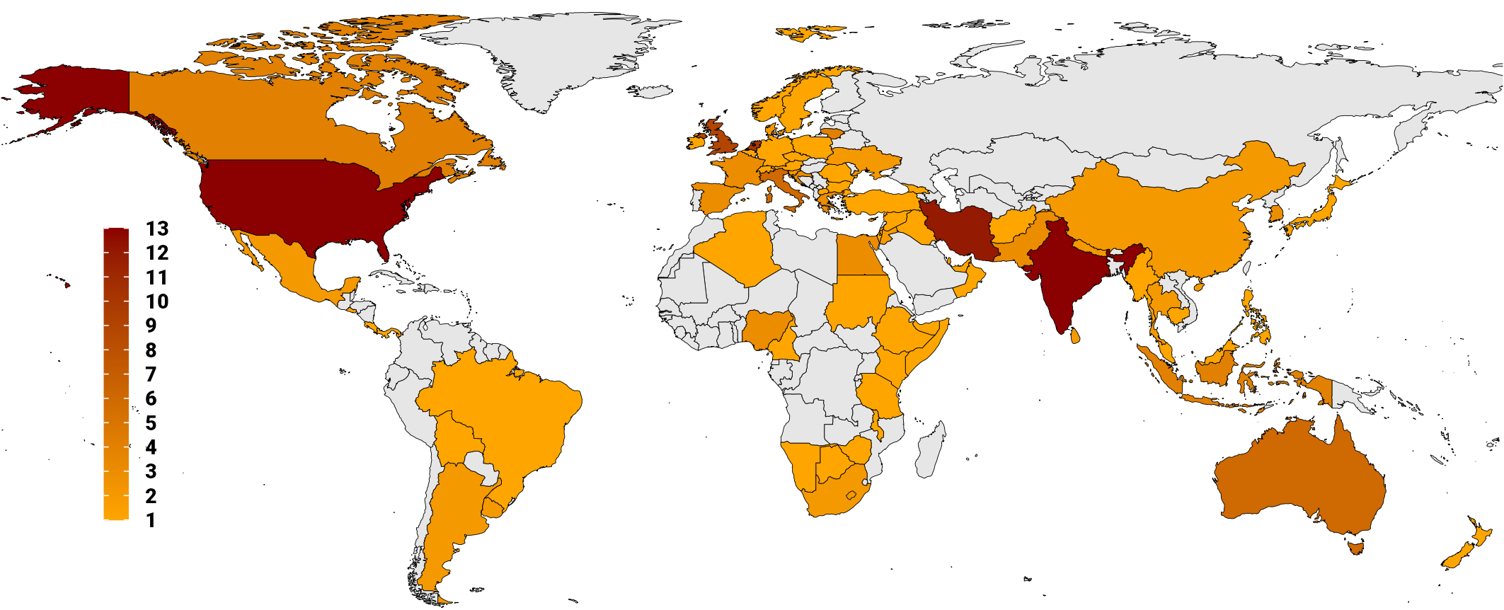
شکل 13.7: نقشه توزیج جهانی تعداد افراد شرکت کننده در هر کشور
- نمودار رسم شده را به صورت واکنشگرا رسم کنید و در
فایلی به فرمت
htmlبا نامglobal-distribution-responsiveذخیره کنید.